Category Archives: Infrastructure

Soil Moisture Monitoring

Our Irrigator uses an old school shovel; poking a hole, looking at dirt. With the installation of our new Irrometer IRROcloud IC-10 we can perform the same task and from afar — no shovel necessary.

An array of sensors buried in the active root zone measure soil water tension. A sensor is an electrode embedded within a specialized granular matrix. Water in the soil exchanges with the matrix, providing an electrical measurement of soil water tension expressed in centibars (or kPa). Sounds like magic. These sensor readings are captured by a data logger and uploaded via cellular to the Cloud allowing us a real-time inspection.

West Block – Muscat

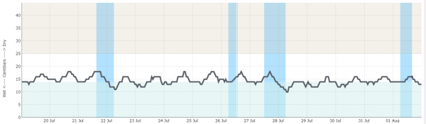
This is actual output from 20 JUL through 01 AUG looking at the 1 foot depth sensors. Moisture is depicted on the Y axis. The X axis shows the individual days.

The [gray] line is an average of the moisture sensors in the root zone and the [blue] bar graph(s) are recorded irrigation events. The upper band of the chart equates to DRY and the lower scale WET. Observe that the typical peaks and valleys correspond to the heat of day and coolness of night. The significant dip (valley) concluding an irrigation set shows a dramatic increase in soil moisture.

The general idea of course is to manage the irrigation; keeping the moisture level within an ideal (white band) range. But, we shall quantify this with the following graphic:

example depicts the Loam soil type

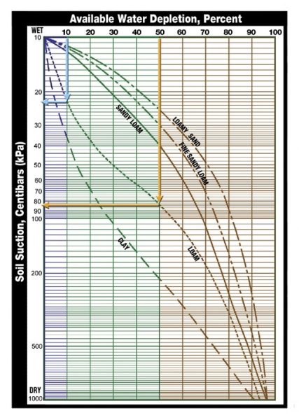
10% depletion of available moisture will determine the WET reference value.
50% is a generalized recommendation for a DRY depletion threshold (point where a plant can not easily extract remaining moisture from the soil without stress)

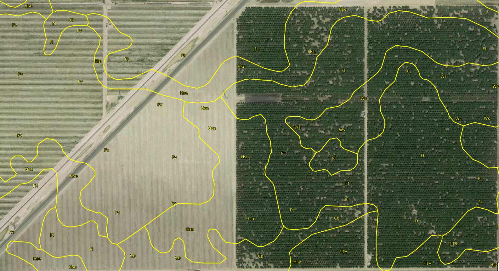
Based upon our Sandy Loam soil one can use the graph to determine the desired moisture range. Entering the chart at 10% and dropping vertically to the correct soil type curve and then coming across horizontally the result would be: 14 centibars as the wetter threshold. Doing the same only entering at 50% on the dry end equates to 40 centibars. [see basics] in between 14 and 40 centibars (the white band) should yield vigorous thriving vines.

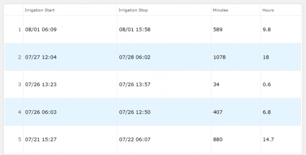
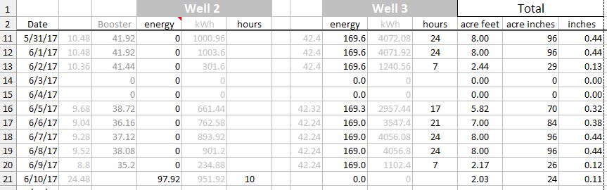
This next image is the irrigation tabulation showing the 5 data sets reference the bar chart atop.

Irrigation Sets
Green data line is a 1′ depth sensor
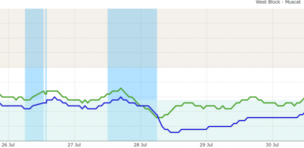
Blue data line is a 2′ depth sensor

This zoomed section shows an inefficiency during the 27-28 JULY irrigation event. The drip system was running for too long (18 hrs.) sending water below the root zone; wasted. The previous set on 26 JUL with a 6.8 hour duration was more elegant (excepting the 0.6 hour subsequent false start).

20-25 centibars might be a good upper end target to begin an irrigation. How did our Irrigator do? Keeping the moisture within an acceptable band was achieved albeit a tad on the wet side being careful perhaps. Not bad considering the shovel method.

Orchard Layout

Nonpareil, as the premier nut, is predominate. The necessary cross-pollinating varieties alternate rows. They all bloom with close timing. The Nonpareil is first. Fritz is an excellent pollenizer for Nonpareil, blooming with or just after the Nonpareil. Butte and Monterey pollinate the late Nonpareil bloom.

Observe this map diagram. It depicts the variety by row number. Note that the rows are numbered starting from the North working South. Also, notice that the varieties carry through from West Field into the East Field. This streamlines the mechanics of planting, harvest and post harvest sanitation. After tree shake the fallen nuts are processed independently however. West field yield is shipped/processed separately from that of the East field. One can visualize how the varieties are organized. The red path lines denote Nonpareil. Green for Butte. Yellow is Fritz and Blue is the Monterey.

There are 118 rows with 22′ spacing between the rows.

Link to full map view

An expert might know the difference but Almond trees all look the same to the layperson. There are [somewhat faded] marking letters brush painted on the tree trunks at the row ends. (e.g. N signifying Nonpareil) to assist. This map reference is the more durable record. Confusing a variety would be a blunder.

The Monterey planting is a bit of mystery. It is said that the layout was conceived without adequate planning notice given to the tree nursery supplier. We are unsure which was unavailable. The Monterey or the Butte variety.

Giving it Meaning and with Emphasis

Modern Irrigation: We track a handful of metrics. Some of them are constants e.g. the pricing rate of energy. There are data points such as pump operational hours that are logged in tabular form. All of this information can be spun with a spreadsheet yielding useful intel.

Recall a previous post on scientific irrigation? It made reference to how much moisture a plant needs to maximize the photosynthetic process and thus crop harvest yield. Too much water is a waste and not enough is detrimental. The task then is to compute how much water are we putting down.

A first thing to understand is the concept of irrigation sets. Each of the vertical bars indicates a set. Think of an irrigator person adjusting or setting the flow so that he can leave for a few hours or attend to other jobs. (He needs to do this precisely because if the flow is too high then flooding occurs) The month of June requires a lot of water. It’s a vigorous growth period. Here you can see that the irrigation set can last for multiple days and extend into a 24hr interval.

Were’d this data come from? In times previous the reporting was scattered and usually furnished in an end of month statement summary. For example the utility company would tell us the energy total for the month and at the end of the period a field hand would read a flowage meter and pass along a reading. Knowing the previous months reading we could find the difference and figure out a total. Bare bones basic and lacking any detail, right? Did I mention that the report dates rarely coincide.

These days, we have smart meters and telemetry that will allow us near real time data collection. A side effect is that the quantity of data can become immense and we’re back to square one trying to make sense of it.

Gathering the data is a first challenge. It comes from scraping an online file and of course it is in a format that doesn’t present in any concise way.

This is just a snippet. It has 3,500 rows and that is just for half the year and only one of the wells! So next step is to fold, spindle or mutilate that raw data to give it meaning.

Observe that each row is a  00 :15 minute window. A daily output however is sufficient granularity. Further we need to convert the energy usage for presentation in layman’s terms. We want to know for how many hours the pump motors ran, on what days, and what proportional share of energy they each used to move “x” amount of water.

“X” amount of water: As said, the water flow meter is our primary tool but only a monthly itemization. There are some known constants that will break this down into a daily amount. We know the pumping capacity based on recent testing and now that we have the daily usage (above) we can formulate the output. More variables and constants and arithmetic that we use:

  • output in GPM is 1,792 and when multiplied by 60 converts to gallons/hour
  • 32,585 gallons == 1 acre foot (an old school agricultural unit of measure)
  • divide 32,585 by our gallons per hour determines how many hours of pumping
  • energy consumption rate expressed in kWh is 169
  • multiply hours of pumping times 169 to find energy per acre foot
  • cost of energy is $0.19 per kWh
  • multiply cost x energy results in cost per acre foot
  • 1 acre foot x 12 converts to acre inches
  • acre inches divided by 220.62 gives us inches of water applied

You get the idea. We can discover all kinds of things; cost per hour, which well and pump delivers the water for less, etc. By studying the data we find how the wells are managed.

We had three wells: #1, #2, #3; oldest to newest. #1 has been retired from service (but could be recalled for emergency use).  Our irrigator has the ability to select between them. It was interesting to observe (from the data) his pattern (not that it made any sense 😉 The irrigation sets are managed by timer clock. It is typical that Well 2 will operate throughout the night — shutting off automatically at 06:45 when Well 3 is brought online. Both wells are rarely operated simultaneously even though we have that capability. Hmmm, answers lead to more questions sometimes.

More enlightenment: In September (2017) there was a system problem. 
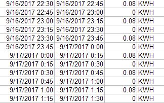
The irrigator finally remedied but this telling data trend would have caught it. The recordation value of .08 is below par and the interval is unusual. This pattern repeats many times.  What is happening is that the motor is attempting an auto startup but failing in the attempt. Evidently the irrigator’s timing of his inspection rounds was such that he missed the momentary start|stop anomaly.  

Irrigation Old Time: The Irrigator is practically redundant. See how much we can do from the remote office? Still, we need someone to establish the Sets. I remember when the Irrigator carried and actually used a shovel. The long handle was convenient for leaning upon 😉 Rubber [Irrigator] boots, and a cowboy hat to block the hot sun completed the look. The Irrigator made his set and watched for water that was getting away or (more hopefully) about to… It was a learned procedure — kind of like the more meaningful methods of today.

Here’s the Dirt

The almond trees are performing as expected and our young vineyard is thriving. Soil is the foundation for plant sustainability. We can analyse it and through care and attention to the elements, maintain its balance. Moisture control, artificial and natural amendments are tools that we can use. The idea is to give back to the soil what is lost and even to enhance it when we can. This takes resources of course and to make sure that we do the right thing we need to know strengths and weakness of our ground. So, what kind of land do we have?

UC Davis and the NCRS present official USDA data in a handy survey map  for our benefit:

Translate the symbols from the map contour above using the legend below and you will know our soil types:

Symbol
Soil Name
Acres
Percentage
Cb
Cajon loamy coarse sand, saline-alkali
13.9
6.0%
Ft
Fresno sandy loam, shallow
90.0
38.5%
Fv
Fresno fine sandy loam, shallow
27.3
11.7%
Fx
Fresno-Traver complex
2.9
1.2%
Hse
Hesperia sandy loam, saline-alkali
28.1
12.0%
Hsn
Hesperia sandy loam, moderately deep, saline-alkali
29.4
12.6%
Hsy
Hesperia fine sandy loam, moderately deep, saline-alkali
12.8
5.5%
Pl
Playas
9.4
4.0%
Ws
Wunjey fine sandy loam
19.8
8.5%
Totals for Representative Mapped Area
233.8
100.0%

Each of these classes have extensive descriptions; the Fresno series for example. As a generalization you might say that our soil is sandy loam. In this part of the valley soil is naturally alkaline and low in organic matter so you could say it does need some help. Here is what it looks like when exposed by backhoe:

This test excavation was made when establishing our new vineyard.

The first few inches are fine sandy loam; grayish brown when moist. Next, slightly lighter colored even lower in organic material and strongly alkaline this layer has a abrupt smooth boundary. At 12-18″ we have sandy clay loam that is slightly sticky and quite firm. Just below this is strongly cemented lime silica hardpan.

The ground trembles when this big CAT ripper sinks that 4′ shank. 

Breaking up the hardpan is an elementary step. Gypsum can be employed to help resist the formulation of hardpan.  Also, Gypsum will exchange calcium for sodium, releasing the sodium into solution allowing it to leach out into 24″ to 60″ stratified loam that becomes friable  and less  calcareous with depth .

Since we have low & medium levels of free lime we apply Sulfur to the soil profile. Soil sulfur will combine with the water and oxygen therein to form sulfuric acid taking the soil pH toward the acidic. To supplement organic material we add Compost.

Take care of your land and it will take care of you.

Zooming In

Inputs singular and combined determine outcomes.  Some are controllable and in order to quantify,  compare, and contrast production we would like to know about our tree and vine producers. We can judge performance against other farmers’ result averages. The Almond Board provides data for this purpose and we can readily see how we are doing in a macro sense. 

The white columns are statewide averages vs. the purple shaded which are ours. The density of trees on a given acre is assumed to be constant but you may not realize that this is not the case. In an effort to increase almond production new farmers are reducing the spacing between the trees and tree rows. (more trees/acre). Science says that, to an extent, there might be gains. A limiting factor would be the ability of sunlight to reach the individual tree.

Therefore a precise measure might be the tree itself. e.g. number of nuts per tree or number of pounds per tree. Whereas acreage is easily determined, number of trees — not so much. Referring to  previous post assumptions, we rely on our Harvester to provide a number. Insuring  Harvester honesty, we know that our tree spacing by design is: 22′ between rows and 18′ between trees. So, knowing an absolute number of trees we need only to subtract the missing to derive the actual.

Let’s zoom in! Can’t get too close however, resolution is restricted. We have to squint in order to realize what we are looking at. Here is a key:

4 missing – you can make out a small spot that is either a hole in the ground or a stump


4 missing – observe 2 recently planted that are a couple of years away from becoming producers. Note the area of shadow (black) cast by the tree (green) 1 newly planted at bottom of this example or is it a remnant? It’s subjective at times.


Toppled tree – see how its canopy lays across the neighboring row. How many missing do you see here?

It is easier to count blanks, the sandy soil is a good contrast to the eye. In healthy areas the tree canopy merges. The individual trees are non-distinquishable in places. View the entire mapping project. I spy 680 missing from the East Block and 675 from the West Block.

Visual Comparison

Recall our rough and tumble Spring weather just a few months back that resulted in significant tree damage and loss in the Almond Orchard. Excessive wind gusts took down many trees as witnessed at ground zero. A Google Maps Satellite image update (3/31/2017) depicts the losses from an aerial perspective. The first image, using Google Earth’s Time Machine feature, shows both West and East fields and dates from March of 2015

The lower image is the more recent

Knowing the number of tree rows and tree spacing we calculate a maximum possible number of trees at 16,995. Of course there will always be gaps because of inefficiencies. In 2015 we estimated 16,337. As 171 of those underlie the PG&E high tension wires and have been severely topped. We can figure 16,166 Healthy, mature, producing trees in 2015.

One could use the Google Maps Mapmaker feature to drop a pin at the newly visible missing tree map locations to get a count. That is tedious work. Instead we will rely on the Almond Harvest Machine to give us a value. It employs a digital counter that increments each time it moves from one tree to the next. Harvest begins next month and we will compare last year’s with this year’s.

South Boundary Question

There’s a county road on our property line, called Dinuba Avenue, that allows access to our farm.  A Dairy Farm, the neighbor to our South, uses this road as well. Public access is restricted because there is a jointly owned locked iron gate spanning its entrance.

We use this road as an equipment turnout as our vineyard rows terminate at the road. It is necessary to have this space for truck and trailer staging during the grape harvest. The busy highway on the opposite end of the vineyard rows is unsafe and therefore not suitable.

Historically, the Dairy has maintained a shoulder on their side of the road. Recently they diverged from their usual business and contracted to have an orchard established. Their new tree rows are to run parallel to the road.  An outer tree row has been planted on the roadside edge.

Considering that their orchard trees will soon develop an expansive canopy possibly extending onto the roadway we are concerned that our access to it will be obstructed.

Overview Video:


The Cost of Water

The PG&E Energy Statement comes every month and it is a major slice of our annual expenses. Dissecting the utility bill while solving for ‘X’ may provide some clarity.

Constants (known assumptions)

  • kWh == kilowatt hours – a measure of energy consumption
  • Well #3 produces 1,792 GPM at a consumption rate of 169 kW
  • Well #2  produces  780 GPM at a consumption rate of 77 kW
  • Booster has a consumption rate of 41 kW
  • Booster Pump must be run during operation of either well.
  • 325,851 gallons == 1 acre foot

Rates for Energy Charge (reference the PG&E document: Large Time of Use Agricultural Power – Schedule AG5B )
Summer
Peak:            $0.20775 12:00 noon to 6:00 p.m. Monday through Friday
Off-Peak:       $0.08974
Winter
Partial-Peak:  $0.10984 8:30 a.m. to 9:30 p.m. Monday through Friday
Off-Peak:       $0.08143

Calculations showing my arithmetic
1792 gpm * 60 min = 107,520 gal/hr so 325,851 / 107,520 = 3.03 hrs to produce 1 acre foot
780 gpm * 60 min =   46,800 gal/hr so 325,851 /  46,800 = 6.962 hrs to produce 1 acre foot

Billing breakdown explanation
There are primarily three types of charges on an electric bill: fixed charges, energy charges and demand charges.

  • Fixed Charges are usually small fees that do not change from month to month. ~$40/month
  • Energy Charges is based on the amount of electricity in kilowatt-hours (kWh) consumed over the entire billing cycle and vary depending on time of use.
  • The amount of electricity being consumed at any single moment is known as Demand (kilowatts).  Demand Charge is a calculation using the maximum energy consumption flow rate seen during the billing period.  For each 15-minute period in a billing cycle, the average demand is calculated. Typically, a motor startup will result in this peak flow rate value but the average over the 15 time interval helps to mitigate somewhat. The utility billing amount for Max Demand is $5.95 and Well #3 has a typical Max Demand of 168 kWh so the product of the 2 would be $1,000.00

Billing summary based upon actual averages
All of this boils down to real world average billed costs (including meter charges, demand charges, etc.) of:
$0.13 kWh  for Well #2
$0.20 kWh for Well #3
$0.12 kWh for the Booster Pump

Usage sample (July / August )
Well #3 running for 3.03 hours produces 1 acre foot of water with an energy usage of 512 KWh with the Booster Pump using 125 KWH for a total of 637 KWh. Cost per acre foot == $117.40 ((512 x .20) + (125 x .12))

Well #2 running for 6.962 hours produces 1 acre foot of water with an energy usage of  536 KWh with the Booster Pump (req’d) using 285 KWH for a total of 821 KWh. Cost per acre foot == $205.25 (821 x .25)

 Takeaway after solving for X

  1. Turning on a well when irrigation is not planned as if only to fill a truck water tank or perform a well test would cost a grand just to throw the switch! See the PG&E service period 11/17/2015 to 12/15/2015 and also PG&E service period 1/15/2016 to 2/16/2016 for Well #2
  2. Well #3 is the more efficient. This Well uses more energy as it is throwing more water (working harder) but it takes less time to get to the finish line.
  3. Off Peak usage is much cheaper. During some summer months the Well(s) must run ’round the clock so the ability to take advantage of rate incentives is limited.

Apologies if you found that topic to be DRY (and sorry for the pun), but water is a critical ingredient for we farmers. I promise future articles on this important resource.